Icon Case Study
Recently I have had the opportunity to work as a design intern at Pave, and one of my roles was helping create clear and consistent icons to be used for the company website, slide decks, and other branding materials. Icons not only add visual interest but help to further communicate ideas or actions. In this case study I’ll be walking you through the process of creating an icon.
Outcome
An icon set that is accessible, clear, and consistent to use across all assets.
Problem
Pave needed a consistent icon set to use for their website, slide decks, and other branding materials.

Finding Inspiration
For this case study I’ll be focusing on the icon for Growth Mindset
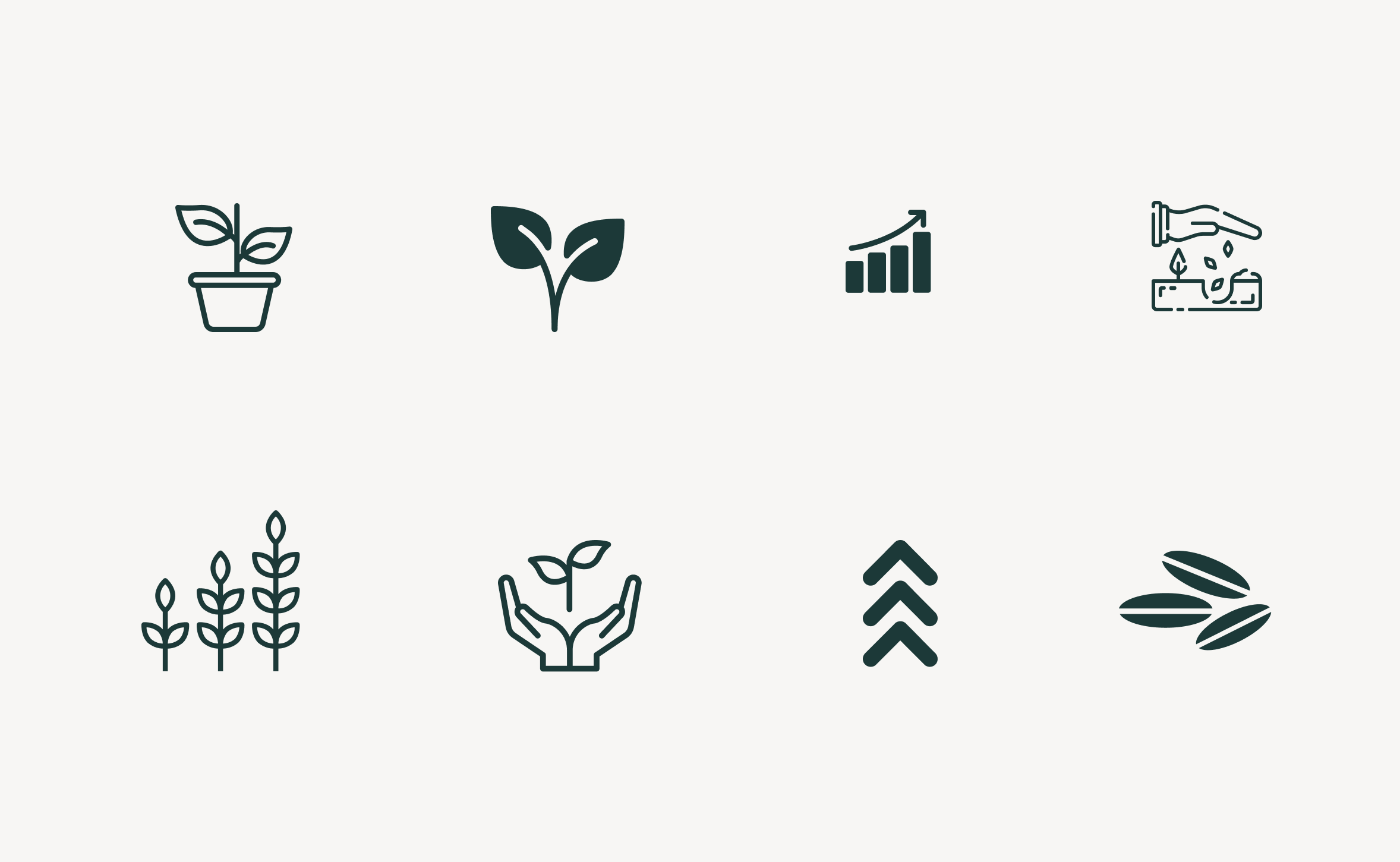
When it comes to icons, there is no reason to reinvent the wheel. There are already associations people make between words and imagery and it is essential to play on that. When I think of the word “growth”, plants, moving upwards, and seeds come to mind.
inspiration icons from the Noun Project
Design Process
When creating an icon for a set, you don’t always know where it will be used. I made sure that the icon I created could still hold it’s meaning when taking on slightly different forms depending on what’s appropriate.

Design Goals
Accessible:
The line weigh and level of detail of the icon allows it to be scaled larger or smaller and still be legible.
Clear:
Although I used a concrete image to represent an abstract concept the link between the icon and the meaning is clear.
Consistent:
I used the the same style I used other Pave assets. As I continued to create the icon set I made sure all the icons looked like they belonged in the same set.
The icons are now on being utilized for the Pave website.
Following the logic used, earlier I was able to construct a full set of icons to be used in for the website, slides, and other branding materials.


